
How to Measure Whether a Technology Project Worked
Login counts and adoption rates measure whether people opened the tool. They do not measure whether anything got better. Most organisations only track the first kind of number, and then wonder why the return on investment is hard to demonstrate.
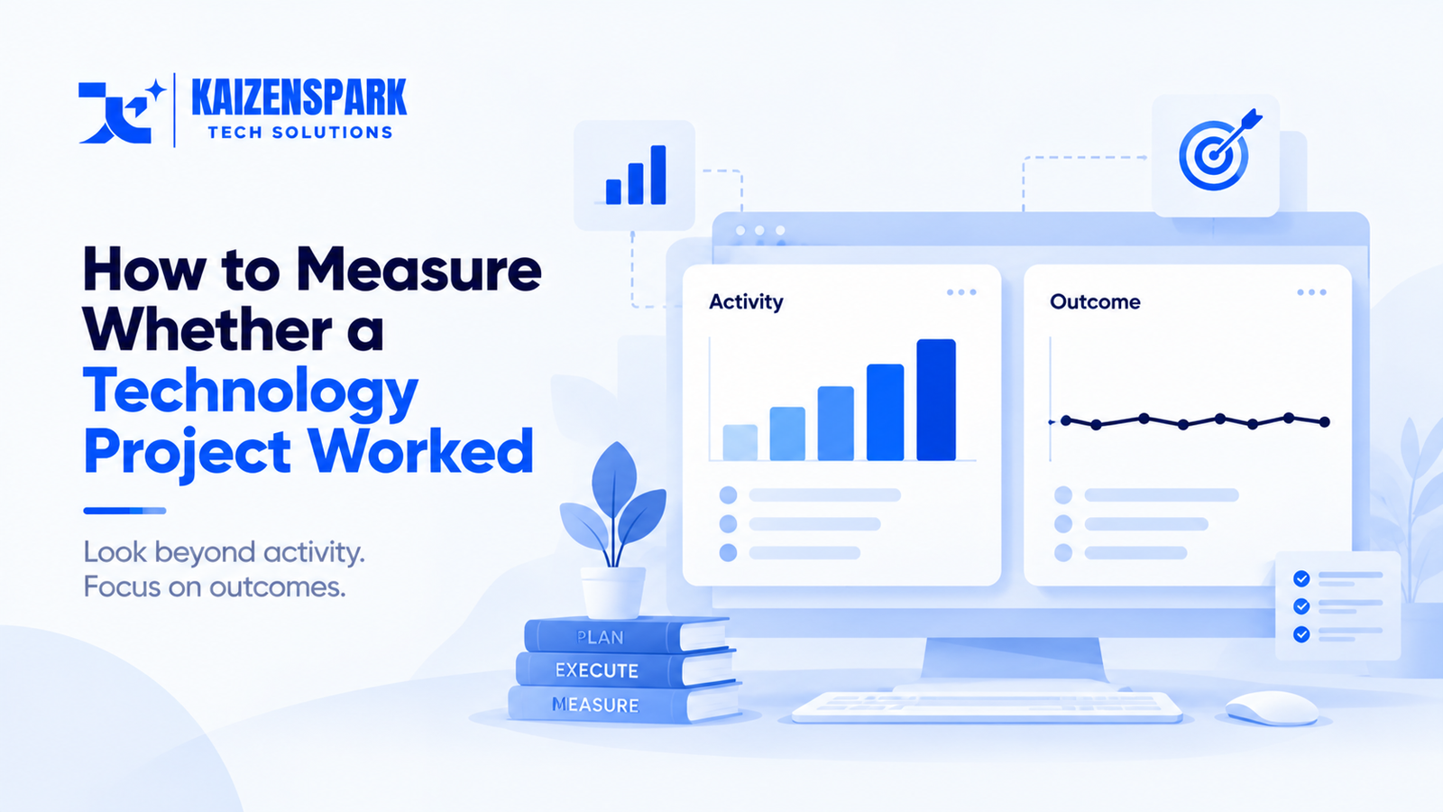
Most post-launch reviews measure the wrong thing, and they measure it because it is easy to measure, not because it answers the question anyone actually cares about. This is a companion piece to our guide on digital transformation.
The distinction that matters
Activity metrics describe whether people used the thing: logins, active users, feature usage counts, support tickets. These are easy to instrument and immediately available from most software platforms out of the box.
Outcome metrics describe whether the underlying business result changed: cycle time, error rate, cost per transaction, revenue per customer, time to resolution. These require knowing what the process looked like before the change and measuring the same thing after, which takes deliberate planning most projects don't do.
A project can show excellent activity metrics — high adoption, frequent use, positive user sentiment — while the outcome metrics show no meaningful improvement, because people can use a tool diligently without the underlying process actually getting better. The reverse is also possible: a tool with modest, grudging adoption that still measurably improves outcomes for the people who do use it consistently.
Why organisations default to activity metrics
They are available immediately, without additional instrumentation. Most software platforms report usage data natively. Outcome data usually requires connecting the tool's usage to a separate business system, which takes deliberate engineering work nobody scoped for.
They tend to look better. A rising adoption curve is a more comfortable slide to present than a flat outcome metric, and the temptation to report the flattering number instead of the complete picture is real.
Nobody captured the baseline. Measuring whether cycle time improved requires knowing what cycle time was before the change. If nobody measured that before launch, the outcome comparison becomes impossible after the fact — not just difficult, genuinely impossible, because the "before" number no longer exists to compare against.
What a real measurement plan requires
Define the outcome metric before the project starts, not after launch. If the goal is faster processing, decide exactly what "faster" means, in what unit, before anyone builds anything — because trying to define success after the result is already in is how motivated reasoning creeps into what should be an objective comparison.
Capture the baseline before the change goes live. This sounds obvious and is skipped constantly, usually because the project's urgency crowds out the several weeks it takes to properly measure the current state before disrupting it.
Separate the pilot population from a comparison group where possible. A before-and-after comparison on the same population conflates the tool's effect with everything else that changed during the same period — seasonality, other initiatives, market conditions. A genuine comparison group, even an imperfect one, substantially strengthens the conclusion.
Track leading and lagging indicators together. Activity metrics are not worthless — they are leading indicators that something is happening, and a sudden drop in usage is an early warning worth investigating. The mistake is treating activity as the destination rather than a signal on the way to the actual outcome.
Report both numbers, honestly, even when they diverge. A project team is naturally motivated to report the number that looks best. The organisation's actual interest is in knowing the truth, including when activity is high but outcomes haven't moved — because that combination specifically points at the workflow redesign gap rather than an adoption problem.
Why this connects directly to the workflow redesign finding
McKinsey's research found organisations reporting the strongest bottom-line impact from AI were far more likely to have redesigned their workflows around the new capability. (McKinsey) You cannot know whether you are in the group that achieved bottom-line impact unless you are actually measuring bottom-line impact — activity metrics alone will not tell you which group you're in.
What we do
We build the measurement plan, including the baseline capture, into project scope from the start, and we report outcome metrics even when they are less flattering than the adoption numbers. If you are planning a project and want a measurement approach that will actually tell you whether it worked, that is a conversation we are glad to have.
Kaizen Spark Tech designs and delivers software, AI, automation and digital infrastructure for businesses and institutions.